Please fill out this survey in class before the end of the year.
Click here: Student Feedback Survey
Friday, June 16, 2017
Wednesday, May 31, 2017
Text Effects
EU: Typography can be manipulated in Photoshop to enhance any design and especially level 1 type
EQ: What text effects can be applied to type to enhance your subject matter in your design?
Examples


Assignment: Choose 5 different words and apply text effects to them using 5 different tutorials from the links below.
Objective: To advance Photoshop skills
Final Project: Add 5 finished words by you to your blog with a reflection and label for each
Links:
55 Cool Photoshop Text Effect Tutorials for Designers in 2017
*or google text effect Photoshop tutorials for more links
*Some of the links and tutorials may not work, may be blocked, or may be too hard for your skill level. Pick the ones that you like and then go from there. If it doesn't work out, choose a different one. There are so many that you will be able to get five easily.
Tuesday, May 9, 2017
Postcard Series

EU: Different effects can be used in both Illustrator and Photoshop to develop a specific look for a design. Understanding how to make certain effects within the programs will help you to advance your Adobe software skills.
EQ: How can you create a 3D text effect using Illustrator?
Assignment: Develop a series of 3 postcards that match for 3 different places
Objective: To learn how to create a 3D text effect in Illustrator and apply it to a design
Summary: You will be creating a series of 3-4 postcards with a vintage or modern style based on different locations in the world. Your locations should go together somehow (European cities, Caribbean islands, etc.).
Size: 5x7 inches Landscape, 300 Resolution
Steps:
- Your first Project Development grade will be to start a sketch brainstorming 3 sets of potential locations groups and the images which may go in them. Will your set be modern or vintage? What can your images be and how will they work on your 5x7 layout. Start here!
- Once you have decided and been approved on your 3 places and your plan of how you will lay out your cards, start work in Illustrator on your 3D lettering using the tutorial in this link (3D lettering tutorial) below. Make sure to choose a font and style it according to your design concept before making it 3D. Imporant*-For now just work on the font and making it 3D with the colors that you like and do all 3 words for the cities at one time!
Monday, May 8, 2017
Final Challenge
Design Challenge Blog Post Steps for an individual project development grade with critique and reflection.....
Steps
Steps
- Post a jpeg of the design challenge that you developed
- Post a jpeg of the design challenge that your classmate adjusted of your work
- Label each image with "Design Challenge" and "Edited Design Challenge"
- In a reflection answer the following questions below (number each question)
- What was your process or thoughts while developing your own piece? Why did you choose certain colors, fonts, images, etc?
- How do you think your piece turned out? Was it successful? Did you finish in time and get everything on there that you needed?
- After seeing the work that your peer edited, do you think the piece got stronger or did it just become different?
- Which piece do you think is the more successful of the two?
- When you look at the one that you think is the most successful, did it address the 4 design principles? Contrast (can you see everything well), Proximity (are items relating to one another grouped together like text), Alignment (is text aligned on the page when necessary), and Repetition (are certain aspects like shape and color repeated within the design)
- Did you like switching projects to see how a classmate edited your piece? Would you like to do this again in the future?
Post to blog
Monday, April 24, 2017
Design Challenge
Assignment: This week is going to be spent on a design challenge with prompts given to you each day and to be finished and uploaded to you blog by Friday.
Objective: To get back into the swing of things after break and to keep your creativity moving as we go into the end of the year.
Assessment: 1 project grade for the week
Subject: The subject or theme of the work is up to you but you must follow the prompts
Monday: Day 1
Open an 8 x 10 inch vertical document, 300 resolution in Photoshop for a final
Using Photoshop and/or Illustrator develop three different patterns using only 2 shapes. The patterns can show interlocking, weaving, gradients, color variations, spacing, etc. It is very open but it should take you the entire block to experiment with them if you are really focused and are on the right track. Pick you favorite at the end of class to apply as the background of your final document.
*Tip: If you are done in 10 minutes then you are not pushing yourself enough creatively to experiment, apply color, etc.
Day 2
Today your challenge is to find a clear photograph from the internet that will be your main focus on on your design project.
*If your background is not done you will need to finish this ASAP
Day 3
Today your challenge is add a third element of your choice to your design and to design Level 1 typography
Today your challenge is add level 2 and 3 typography and refine your design
Objective: To get back into the swing of things after break and to keep your creativity moving as we go into the end of the year.
Assessment: 1 project grade for the week
Subject: The subject or theme of the work is up to you but you must follow the prompts
Monday: Day 1
Open an 8 x 10 inch vertical document, 300 resolution in Photoshop for a final
Using Photoshop and/or Illustrator develop three different patterns using only 2 shapes. The patterns can show interlocking, weaving, gradients, color variations, spacing, etc. It is very open but it should take you the entire block to experiment with them if you are really focused and are on the right track. Pick you favorite at the end of class to apply as the background of your final document.
*Tip: If you are done in 10 minutes then you are not pushing yourself enough creatively to experiment, apply color, etc.
Day 2
Today your challenge is to find a clear photograph from the internet that will be your main focus on on your design project.
- Change the image to black and white and
- selected out to create a unique shape rather than a basic rectangle
- adjust your contrast and/or levels in order to allow the image to not look overly grey
- apply an artistic filter that does not overly distort the image
- apply a gradient of color over a portion of your photograph
- Add photograph to your document over the patterned background (think about composition)
*If your background is not done you will need to finish this ASAP
Day 3
Today your challenge is add a third element of your choice to your design and to design Level 1 typography
- Make sure that your challenges from days 1 and 2 are complete
- Choose a third element that will go between your patterned background and you black and white filtered image. (This element may be another image, a shape, a design you make, etc but it has to be noticeable and it cannot fight with your original image. It must complement what you already have designed)
- The Catch. The third element must interlock with your background somehow. I want you to make sure that some of it weaves or looks like it is disappearing into the background in some areas so that you provide some depth in your design
- Next think about what you can have for Level 1 typography? What is your design about? Is there a title, a quote, or a tagline?
- Decide on two fonts that complement each other (one serif and one san serif). Think about thick vs. thin, structured and traditional vs decorative, etc.
- Add in the Level 1 Type into your image
Today your challenge is add level 2 and 3 typography and refine your design
- If 2 fonts are not already chose, make sure to get that all set and add your text. The text is up to you and will vary dependent upon your content. What would make sense for your design and images?
- Refine your design now that it is coming to completion. Check spelling, change colors, touch up edges, etc.
- If you need to add in a bit more as far as blocks of color to help you smaller text stand out that is acceptable
Tuesday, April 4, 2017
Spring Concert Poster
Assignment: Design a Spring Concert Poster for the BHS Music Department
Required Text: (This information must be on the poster but does not have to worded exactly this way. For example. Date can say 5.11.17, etc.)

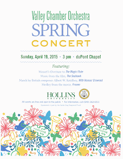


Required Text: (This information must be on the poster but does not have to worded exactly this way. For example. Date can say 5.11.17, etc.)
- Spring Concert
- Thursday, May 11th 2017
- 7:00 pm
- Beth Bourne Auditorium
- Admission is Free
- World debut of original music by BHS grapduate Ian Good
- Head Shot of Ian Good must be included (small and maybe toward bottom) Save from this blog post.

Size: 16x20 Vertical or Horizontal, 300 Resolution
Software: Photoshop and/or Illustrator
Poster Criteria:
- Strong eye-catching image
- Typography-Easy readability with no spelling errors (Level 1, 2, 3 type)
- Color-Bright and cheerful. Think Spring!
- No photographs straight from the internet. Think more simplified. If you do use one it must be manipulated. Even better if they are original.
- Tip: If using instruments, make sure to only use what we have at BHS (snare drums, clarinet, flute, saxophone, tuba, triangle, piano)
Examples


Wednesday, January 4, 2017
Identity Design/Branding
Objective: Use these blog posts to help you plan your logo and to help you understand identity design and branding
LOGO DESIGN
Subscribe to:
Posts (Atom)